

All references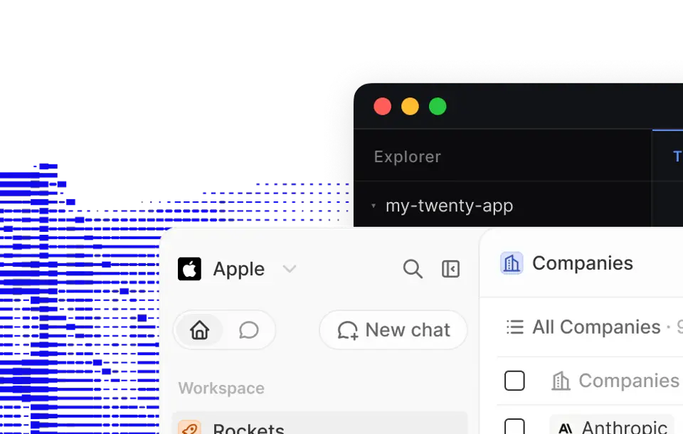
App / CRM
Twenty
Original reference by Twenty
Reference preview · React · NestJS
THE COMPLETE BRIEF
A prompt with a point of view.
Art direction, behaviour, responsive states and implementation detail. Read it, adapt it, then hand it to your crew.
Read the full prompt20,218 characters
# Recreate this reference faithfully: Twenty

You are an expert creative front-end developer. Reproduce the referenced app so the rendered result is recognizably the same first-view composition shown in Foxora. This is an exact reconstruction task, not an inspiration exercise and not a request for a redesign.

Prompt registry version: 7.4.0.

## Delivery contract

- Before editing, classify the open workspace. Use its root only when it is empty, was created specifically for this template, or is the exact source repository named above.
- If the open workspace contains an unrelated application or user work, do not modify, delete, rename, move, or replace any existing file or route. Create an isolated child project named `github-twenty` and treat that directory as the implementation root. If the environment cannot isolate a child project safely, stop and ask the user to open a new empty project.
- If no project exists, use https://github.com/twentyhq/twenty as the starting codebase. Follow its README and lockfile; install and run the official application instead of producing a one-file visual imitation.
- Do not replace the source application with a self-contained `index.html`, screenshot recreation, or newly invented shell.
- The finished page must load at the normal root route '/' with no required hash. Do not route the user to '#cta', '#hero', a component gallery, a design-spec page, or a different demo.
- Do not stop at a plan, wireframe, component specification, or prose explanation. Write and run the implementation.
- Keep dependencies minimal. Load an external library only when it is essential to reproduce an observed effect, and pin its version.
- Preserve a source-credit comment in the code without adding a visible credit block that changes the reference composition.

## Reference pack — open these before coding

- Foxora showcase detail: https://showcase.foxora.studio/prompts/github-twenty/
- Foxora cached poster (stable HTTPS): https://showcase.foxora.studio/thumbnails/curated-github-twenty.webp

- Original reference visual: https://raw.githubusercontent.com/twentyhq/twenty/main/packages/twenty-website/public/images/readme/github-cover-light.webp
- Exact source page: https://github.com/twentyhq/twenty
- Source collection / creator library: https://twenty.com/
- Source format: React · NestJS
- Creator credit: Twenty on GitHub
- Source terms recorded by Foxora: AGPL-3.0 core · enterprise-marked files excluded

Open the Foxora cached asset and the exact source page before writing components. The cached asset is the visual baseline; the source page is the interaction and context baseline. If the environment cannot access either baseline, stop and report the inaccessible URL instead of inventing a substitute.

## Implementation authority — inspect before coding

- Authority type: open-source repository.
- Exact implementation authority: https://github.com/twentyhq/twenty
- Original listing and terms: https://github.com/twentyhq/twenty
- Authority captured by Foxora: 2026-07-27.
- Bootstrap rule: Use the exact source repository as the implementation starting point. Inspect its README, lockfile, package scripts, environment example, route tree, and existing components before editing. Preserve the source stack and run the official application; do not redraw its poster in a new project.

Do not start from the Foxora thumbnail. Open the exact implementation authority first. If it is unavailable, stop and report that URL; do not fabricate an equivalent design.

## Source-specific understanding

- Required visible copy and terminology: Twenty; People; Companies; Opportunities; Workflows.
- Required layout zones: Twenty application shell; Quiet white data canvas, compact object navigation, precise table and kanban density, soft gray surfaces, tiny colored record accents, and polished command interactions.; customizable CRM object navigation working state; table, kanban, record, and relation views working state; command menu, workflows, and keyboard operations working state.
- Required working interactions: customizable CRM object navigation; table, kanban, record, and relation views; command menu, workflows, and keyboard operations.
- Responsive behavior: Preserve the repository's real responsive navigation, pane collapse, table or canvas overflow, dialogs, keyboard behavior, loading, empty, error, and success states.
- Asset policy: Reuse assets already licensed and committed in the source repository. Do not replace the defining UI with the Foxora poster or invent stock media.


### Authority acceptance checks

- The project is bootstrapped from the exact repository or its exact source tree.
- The official startup command reaches the real primary product route.
- The source navigation, terminology, controls, and core workflow remain recognizable and functional.
- No marketing hero, screenshot plate, or unrelated dashboard replaces the application.

## Exact asset manifest — copy unchanged

```json
{
  "registryVersion": "7.4.0",
  "slug": "github-twenty",
  "kind": "App",
  "source": "https://github.com/twentyhq/twenty",
  "poster": "https://showcase.foxora.studio/thumbnails/curated-github-twenty.webp",
  "motion": null,
  "originalVisual": "https://raw.githubusercontent.com/twentyhq/twenty/main/packages/twenty-website/public/images/readme/github-cover-light.webp",
  "referenceOnly": true,
  "normalRootMayRenderReferenceMedia": false,
  "frame": {
    "width": 960,
    "height": 610,
    "aspectRatio": 1.5738
  }
}
```

These values are immutable for this task. Do not shorten, redirect, proxy, rename, regenerate, or substitute any manifest URL.

## Source-of-truth order

When instructions conflict, use this order:

1. The public source implementation recipe, when included below.
2. The exact source page and its visible behavior.
3. The Foxora cached poster or animation for visual comparison only.
4. The authored anatomy below.
5. General implementation conventions.

The reference is a specification, not a mood board. Do not replace its central artifact with an easier illustration, generic 3D primitive, stock dashboard, gradient blob, bento grid, or unrelated product.

## Exact visual target — FX-049D4CD0

- Product domain: CRM application.
- Required root artifact: A faithful, responsive reconstruction of the Twenty primary product interface.
- Root view: Twenty primary product interface.
- Native Foxora capture: 960 × 610px, aspect ratio 1.5738.
- Desktop comparison viewport: 1440 × 900px.
- Visual DNA: Quiet white data canvas, compact object navigation, precise table and kanban density, soft gray surfaces, tiny colored record accents, and polished command interactions.
- Composition map: Match the cached application poster as one measured workspace. Preserve the original navigation, sidebars, toolbars, content panes, tables, cards, charts, forms, controls, data density, and active state without adding a marketing shell.
- Interaction or motion identity: Make the visible crm workflow real and deterministic. Prioritize customizable CRM object navigation, table, kanban, record, and relation views, command menu, workflows, and keyboard operations, then add only the interactions implied by the source.
- Visible product entities: CRM; customizable CRM object navigation; table, kanban, record, and relation views; command menu, workflows, and keyboard operations; active workspace state.
- Signature moments that must survive: customizable CRM object navigation; table, kanban, record, and relation views; command menu, workflows, and keyboard operations.
- Forbidden drift: a marketing landing page in front of the app; generic dashboard cards that replace the source workflow; different navigation, data density, terminology, or product state.
- Required semantic cues: twenty; crm; customizable.

Do not change the product category or the artifact type. During the visual-parity pass, preserve visible reference copy, labels, number formatting, control names, and line breaks where they can be read. If a word is genuinely unreadable, use replacement text with the same approximate character count and wrapping; do not invent a new campaign or long-form product story.

## Non-negotiable visual anchor

- Primary subject: customizable CRM object navigation.
- Silhouette and occupancy: Preserve the exact application shell, pane proportions, navigation density, dominant working surface, and visible active state.
- Material, palette, and contrast: Quiet white data canvas, compact object navigation, precise table and kanban density, soft gray surfaces, tiny colored record accents, and polished command interactions.
- Motion or interaction: Implement only the transitions and state changes implied by customizable CRM object navigation, table, kanban, record, and relation views, command menu, workflows, and keyboard operations; keep the initial screenshot deterministic.
- Framing and negative space: Fill the viewport with the product interface exactly as shown, without an outer browser frame or promotional hero.
- Implementation requirement: Build a semantic application as the normal root experience. Use the cached poster only in an explicit QA comparison mode, never as the shipped interface.
- Forbidden substitution: Do not substitute the defining customizable CRM object navigation with a generic component, stock layout, or different product concept.

This is a faithful product-interface reconstruction, not a marketing website and not a screenshot plate. The normal root MUST be the real semantic application. Rebuild the visible chrome, navigation, controls, tables, charts, forms, data density, copy, and state. Do not rename the product, prepend a landing-page hero, create an unrelated dashboard, or add decorative marketing chrome.

## Mandatory implementation recipe

### Required reconstruction and comparison implementation

1. Build or run the real semantic UI at the normal root route. Bootstrap from https://github.com/twentyhq/twenty, preserve its source stack and existing component tree, and run its real primary product route. The normal root must never be covered by the cached poster and must not require `?live=1`.
2. Keep the exact poster URL only in a source-credit/QA comment or optional development-only comparison tool. Never use it as the normal root, loading state, fallback, background, iframe, or interaction surface.
3. If you add `?reference=1`, make it an explicitly labeled QA overlay with `pointer-events: none` that is absent by default. It must not change the DOM underneath or be necessary for the application to look complete.
4. Compare the real root at 0%, 50%, and 100% QA overlay opacity. Correct zone bounds, copy wrapping, focal-object scale, media crop, palette, radii, and density until the live UI aligns with the poster.
5. Preserve readable labels, values, and product terminology from the exact reference. Use the authored entities only to fill genuinely unreadable details; do not replace the product with a different concept.
6. Implement every visible control and the primary workflow. A screenshot with invisible hotspots, dead controls, or decorative tables does not pass.
7. Test the real root at 960 × 610px and 1440 × 900px, then verify tablet and mobile behavior.
8. Before reporting completion, assert that no cached Foxora poster URL appears in a rendered `img`, CSS `background-image`, canvas texture, iframe, or full-page overlay at the normal root.

The implementation is incomplete if the default page is a reference plate, screenshot, iframe, static mock, or unrelated redesign.

## Frame and geometry lock

Treat the 960 × 610px cached capture as a measured artboard.

- Reproduce the same major horizontal and vertical zones, their order, their relative widths and heights, and their alignment.
- Match the focal subject's center, scale, crop, overlap, and amount of surrounding negative space.
- Match text block width, line count, alignment, approximate cap height, and distance to adjacent controls.
- Match navigation height, side insets, card radii, border weight, shadow softness, media crop, and surface density.
- Preserve what is above the fold. Do not push the defining visual below the viewport.
- Do not add a large wrapper card, browser frame, floating navigation pill, side rail, or hero panel unless the reference contains it.
- Use CSS custom properties for sampled canvas, surface, text, border, accent, shadow, radius, and spacing values. Sample from the reference rather than choosing a new palette.
- Match the reference at its native capture size first, then at 1440 × 900px. A responsive version is not allowed to change the desktop art direction.

## Required page anatomy

Build the root view first and in this order:

1. Canvas and page shell: reproduce the base color, texture, clipping, overflow, and minimum-height behavior.
2. Global or application navigation: recreate only the controls and density visible in the reference.
3. Primary copy or information region: keep its exact side, width, hierarchy, alignment, and line wrapping.
4. Primary visual or working surface: implement customizable CRM object navigation as the dominant artifact.
5. Supporting reference cues: implement table, kanban, record, and relation views; command menu, workflows, and keyboard operations.
6. First fold transition: include only the content already visible at the lower edge of the reference.

The primary view is 'Twenty primary product interface'. The following may be implemented only after the root screenshot passes: customizable CRM object navigation state; table, kanban, record, and relation views state; command menu, workflows, and keyboard operations state. They must not replace, precede, or visually dilute the root artifact.

## Interaction and state fidelity

- Every control visible in the reference must have an appropriate hover, focus, active, and disabled treatment.
- Buttons, tabs, filters, form fields, menus, close controls, and primary actions must work instead of being decorative.
- Use realistic crm application data for CRM, customizable CRM object navigation, table, kanban, record, and relation views, command menu, workflows, and keyboard operations, active workspace state; preserve the visible density and formatting of the source.
- Keep all initial values deterministic so the first screenshot is stable on every reload.
- Animation must begin in the same visual state as the reference and settle into the same hierarchy. Do not add perpetual motion to elements that are still in the source.
- Prefer transform and opacity for UI transitions. Pause expensive work when offscreen or when the document is hidden.
- Respect 'prefers-reduced-motion' with a composed static state that still matches the settled reference.
- Never autoplay sound.

## Asset rules

- Preserve the exact HTTPS reference URLs in a source-credit/QA comment. Do not convert them to localhost paths, guessed filenames, expired blob URLs, or runtime media unless the public source recipe explicitly identifies that media as part of the implementation.
- Do not hotlink logos, portraits, product photography, or proprietary media from the source page unless the recorded source terms permit it. For visual QA, the Foxora cached reference remains available as a comparison target.
- Foxora posters and animated WebPs are visual QA references only. They must not be rendered at the normal root for Motion, Website, or App entries.
- Build the real DOM, CSS, SVG, canvas, WebGL, or source-media implementation as the default experience. Never pretend a poster, screenshot, or screen recording is interactive UI.
- Provide an intentional fallback for asset failure that keeps the layout dimensions stable.
- Keep the reconstructed primary subject sharp at desktop and mobile densities; preserve the measured crop and aspect ratio without stretching.

## Responsive behavior

- Desktop geometry is reference-measured. Tablet and mobile are careful recompositions of the same hierarchy, not new designs.
- At narrower widths, preserve the focal subject before secondary decoration; reduce or move peripheral labels only when necessary.
- Keep text readable without changing its character, maintain at least 44px interactive targets, and avoid horizontal overflow.
- Preserve deliberate overlap and crop relationships. Do not stack every element into generic full-width cards.
- Test at 1440 × 900, 1024 × 768, 768 × 1024, and 390 × 844.

## Accessibility

- Use semantic landmarks and heading order, labeled controls, meaningful alt text, visible keyboard focus, and logical tab order.
- Keep essential text and controls at WCAG AA contrast.
- Do not make motion the only carrier of meaning.
- Avoid adding visually hidden interaction that conflicts with what sighted users see.

## Implementation order — do not skip

1. Open and inspect every available URL in the reference pack.
2. Observe the reference at native size. Record, internally, the major zone bounds, focal point, text line count, palette, type character, border radius, and shadow behavior.
3. For motion, inspect opening, midpoint, and settled states. For an app, identify every pane and control. For a website, identify the hero and first fold transition.
4. Implement the mandatory recipe above before creating any secondary component. Build the real page shell, defining motion or working surface, visible copy, and controls now.
5. Render at 960 × 610px and compare side by side with https://showcase.foxora.studio/thumbnails/curated-github-twenty.webp.
6. Correct geometry, typography, color, crop, and density before adding secondary behavior.
7. Render at 1440 × 900px and repeat the comparison.
8. Add working interactions and responsive layouts without changing the approved desktop composition.
9. Run a final browser check for console errors, missing assets, broken controls, overflow, reduced motion, and keyboard access.

## Visual acceptance gate

The implementation passes only when all of these are true:

- At first glance, the root screenshot is recognizably Twenty, not merely the same genre.
- The root artifact is still a faithful, responsive reconstruction of the twenty primary product interface in the crm application domain.
- Major zone bounds, focal-subject position, and viewport occupancy are within roughly 4% of the reference.
- Heading and primary copy line counts match; typography does not wrap into a different composition.
- The dominant palette, contrast distribution, surface density, radii, and shadow character match the cached capture.
- All three signature moments are present: customizable CRM object navigation; table, kanban, record, and relation views; command menu, workflows, and keyboard operations.
- None of the prohibited substitutes appear: a marketing landing page in front of the app; generic dashboard cards that replace the source workflow; different navigation, data density, terminology, or product state.
- The exact source links and credit remain in a code comment or project documentation.
- All referenced assets return successfully over HTTPS; no visible broken image, CORS failure, or localhost-only URL remains.
- The root experience works at '/', without '#cta' or another hash being required.
- The normal root is the semantic reconstruction itself; it does not contain a full-page Foxora poster, screenshot, iframe, or reference lock.
- Every visible control and the primary workflow work at the default route.
- If a `?reference=1` QA mode exists, it is absent by default, pointer-transparent, and never required to make the normal root look complete.

## Fail-closed rule

If the primary visual anchor, root artifact, or major composition differs materially from the reference, the project is incomplete even when the code compiles. A page that merely renders Foxora's reference media is also incomplete even when its pixels match. Continue correcting the real root view and its interactions or report the exact blocker. Do not claim success, add unrelated sections, or substitute a simpler design.

Return the working implementation and a concise verification note listing the tested route, viewports, reference URLs, and any intentional deviation.